Responsive Design: an approach to designing and programming a website wherein, depending on the size of the screen on which it is being displayed, content on the site is scaled, rearranged, and/or transformed in the interest of making it as easily viewable and accessible as possible.
In other words, your website works good on phones and stuff.
In the era of the mobile internet user, responsive design isn’t something that can be ignored. It isn’t some “extra” perk to carefully consider—it’s a necessity that will directly influence the performance of your website, from the amount of time users spend there to the number of pages they visit to the conversion rates.
Usage of mobile devices to access the internet is increasing rapidly. Over 20% of all browser traffic now comes from mobile devices.
With 1 in every 5 of your customers accessing your site via a tablet or smartphone, it’s not feasible to avoid mobile optimization. Studies and stats show time and again that websites that provide their mobile users with a good browsing experience have higher conversion rates.
If your website isn’t ready when a mobile user stumbles upon it, there isn’t going to be a second chance. Non-responsive websites feel clunky and slow and ultimately alienate mobile users.
So what about mobile versions of websites? A mobile version of a website can be just as helpful as a responsively designed website to the user.
However, mobile websites are simply not a good choice if you’re a business owner—especially if you’re a small business owner who needs to be found on search engines.
That’s because you have to create a whole new domain for your website (often m.example.com). This hurts your primary site because traffic is now split between two different websites, even though they’re technically the same page. The search weight of your site is hurt due to this schism and search traffic is reduced.
Responsively designed sites, on the other hand, don’t have to deal with two separate domains. Your website is your website, no matter what device it’s being viewed on. Traffic goes to the same place and your website can rank as high as possible.
Your website is also future-proof with responsive design, allowing for dynamic scaling onto new devices and platforms that haven’t even been made yet. Because of the nature of the programming that makes responsive design work, you never have to worry about whether or not your site will work on the hottest new smartphone.
West County builds all of our sites responsively. We know that responsive design is not just a trend, but a shift in the landscape of web design that will be with us for quite some time.
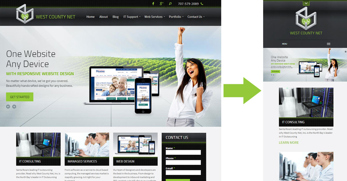
If you’re still not sure exactly what responsive design is, head on over to our home page. Once there, play with the width of your browser window. As you make the browser smaller and smaller, you’ll notice that elements in the page resize themselves dynamically and automatically. No matter what the size of the browser, you can clearly interact with all of the aspects of the site and access all of the information.
If you’re interested in having a responsively designed website, feel free to contact us! Even if you want to keep your website the way it is without changing anything, we can still make it responsive.