Why It’s Important to Stay Ahead of Web Design Advancements
A lot has changed since the initial internet boom of the 1990s. The internet is bigger, faster, and constantly evolving. The same can be said of web design trends. We all understand that with time comes change. And with change comes reflection. And this principle is no less apparent than when we compare the internet of our youth to today’s global network. Every 80s and 90s kid can distinctly remember the sound of dial up as you logged into AOL messenger. Or that you couldn’t use the phone and the internet at the same time.
Comparing websites today to those of 20 years ago brings into focus a lot of advancements that have made internet life easier. However, if you are one of those businesses that hasn’t touched your website in years because you don’t see the need to, you may be missing out on all the opportunities the web has to offer. A simple design update and content refresh can dramatically affect your business prospects. This is no less apparent in comparing many large platforms of today with their counterparts from yesterday. So let’s take a stroll down memory lane and revisit web design trends, both good and bad, from 2002.
Best Web Design from 2002
Even in 2002, web designers understood the importance of speed as an important aspect of a quality user experience. Websites utilized the ease and simplicity of text content which took a smaller toll on loading and refresh time. Take a look at the following example of Netflix’s website from the time.

Yes. It may surprise some of you to know that Netflix was once Blockbuster’s competitor in the VHS and DVD rental space and NOT the streaming giant it is today. But enough about that. Instead, look at their use of graphics and text. Images were used minimally. After all, even today images can take up lots of space and make page loading time stretch if not properly optimized. Image optimization for the web was a new concept by 2002’s standards and not yet widely adopted, or even heard of. So instead, web designers employed small images combined with descriptive text.
Also taking a look at the Netflix homepage, you can see that Netflix’s designer utilized a strict table layout. By using a table, designers could control exactly where elements would sit without worrying about them moving around. It also helped keep text and images in line with one another.
The use of tables also gave web designers the ability to create fixed navigation. Check out this example from 2002 of the ever popular video game digital distribution service, Steam.

Menus on the homepage marked a dramatic change in how designers and developers thought about navigation. Menus were not elaborate in the way they are today, so designers had to choose only the most important pages to feature or adopt overly cumbersome sidebar menus a la ye olde Amazon bookstore of 2002.
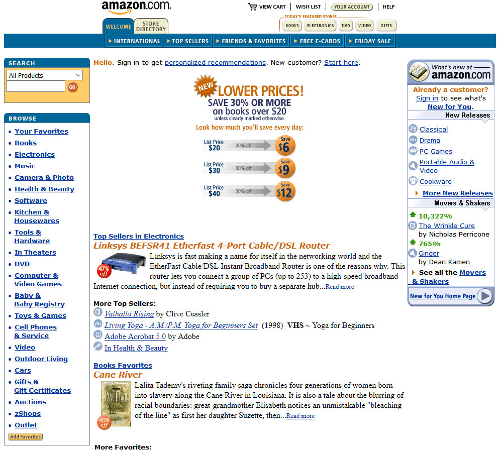
Lastly, web design in 2002 valued compactness even at the cost of readability. Text is compressed into neat squares and rectangles that take up less space. Unfortunately this meant that text was less legible. Individual paragraphs and headings were distinguished from one another with lots of whitespace, line breaks, and icons. As a result, web pages designed like this were quick to load and quick to read.
Worst Web Design from 2002
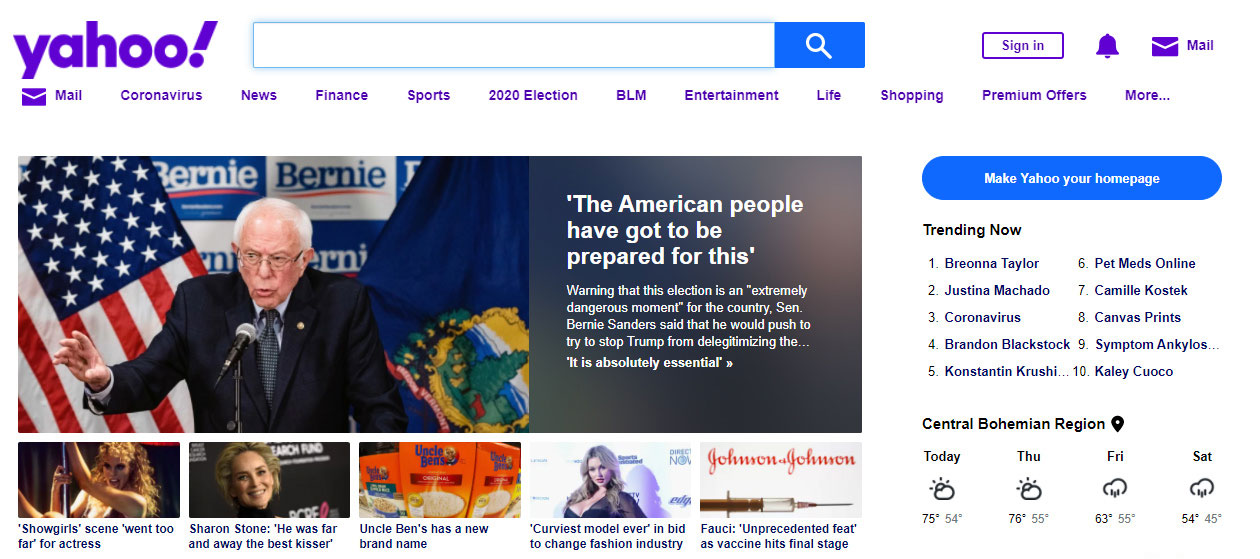
Of course, every up has its down, and many of these same “best practices” were later regarded as “bad practices”. For instance, while compact blocks of text were great for the early 2000s, today they would not be. In fact, look at the following example from Yahoo circa 2002.
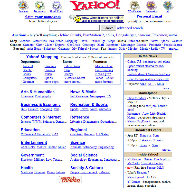
At first glance, the layout is very neat and deliberate. Yahoo! Shopping has its own distinct section, as does the sidebar, Local Yahoo!s, etc. However, the more you view the page, the more overwhelming its content becomes. The entire page is made up of linked text stacked one on top of the other. The eye doesn’t know where to go or where to stop. Even those unfamiliar with web design trends would know this style to be archaic.
Furthermore, another sign of the time was the fixed font size. Responsive or fluid typography had not been established so the same font size displayed on all screens of any resolution. So if the designer chose a size 14px font, that was the font size for small monitors and large monitors alike. This of course meant that content organization was very rigid. Text boxes either had strict dimensions or were subject to stretching and shrinking according to the screen size. So on the one hand, layouts were very fixed and worked for a specific screen size, or fluctuated, shifted, and moved with each screen size.
This lack of responsiveness also led to weird side effects including the once questionably popular horizontal scrolling. Sometimes when fixed content didn’t fit in the browser window, it would spill beyond creating unanticipated scrolling. Horizontal scrolling forced the reader to have to navigate both vertically and horizontally. And weirdly enough, there was a very brief point in time when horizontal scrolling was preferred over vertical scrolling. Again, very brief for the very obvious reason that trying to scroll horizontally with a mouse and keyboard is not nearly as intuitive as vertical scrolling.
Best Web Design from 2022
It’s only with retrospect that we are able to recognize change and progress. So by looking at good and bad trends from 2002, we can appreciate how far web design has come over the past 20 years. For instance, take a look at Netflix’s contemporary website. There is a noticeable difference between Netflix today and Netflix of yesteryear.
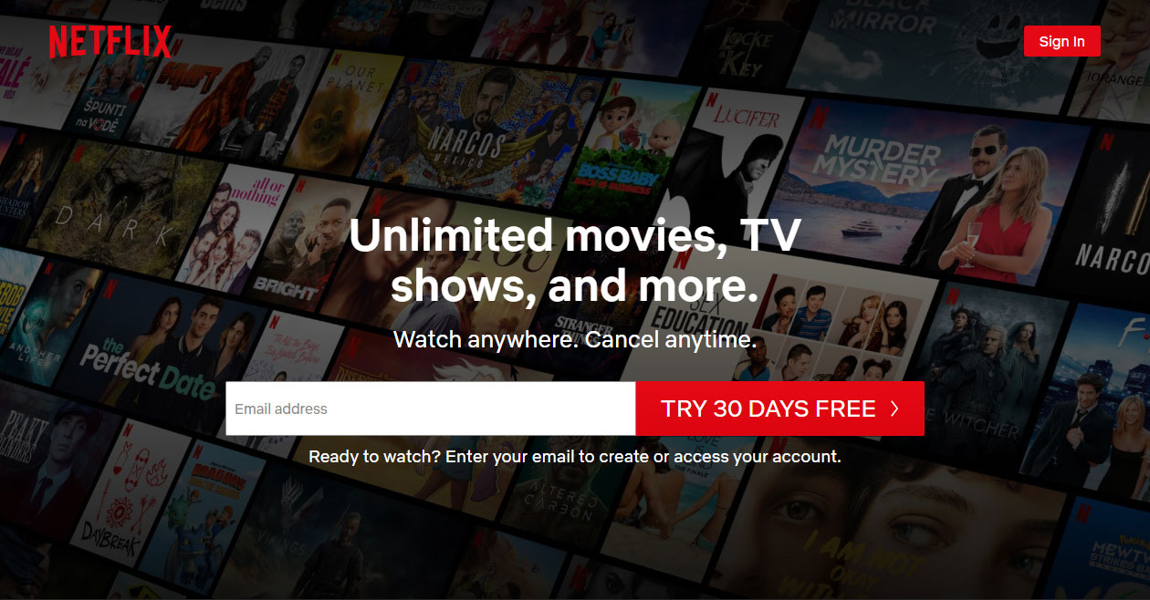
First and foremost, notice the balanced use between graphics and text. Neither comes across as overwhelming. They use a black gradient overlay over the background images so they aren’t in as much focus. The designer chose to use bold white text to contrast the dark background. The content itself is succinct and concentrated, getting the point across in as few words as possible. Lastly, the call-to-action (CTA)—the signup form—is front and center without any fluff.
Similarly, take a look at today’s Amazon. A few things stand out.
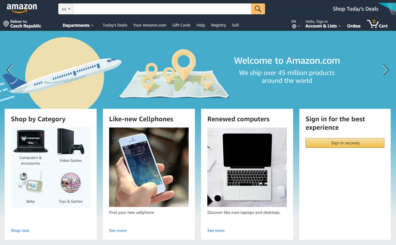
The main navigation has been moved from the sidebar to the top. It’s also noticeably smaller and more compact thanks to the advent of dropdown menus. Plus, check out the layout and design on mobile and tablet.

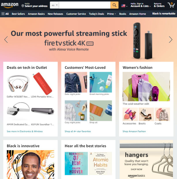
Notice that when comparing the size of the font between the two resolutions, the size ratio does not change. That is because the designer opted for a fluid font size which changes based on the size of the screen. This means that the font is technically bigger on tablet and mobile than it is on desktop, but it looks the same in proportion to the screen size.
Now let’s take a look at Yahoo! of 2022 compared to 20 years ago.

The most obvious difference between the two is that today’s Yahoo! uses a fair balance between graphics, text, and whitespace. Notice also that while most of the content on today’s page are still in fact links, those links are not all blue, underlined text. This makes the page significantly easier to peruse with the eye.
Another noticeable change is in the layout of the page’s content. On the right, we can see a strict use of table rows and cells to divide the content into even, predictable blocks. On the left, we see the use of what is known as a grid framework. A grid framework is similar to tables in the sense that it helps create spatial consistency; however, a grid allows designers to change the width of any given element (image, text, link, etc.) effortlessly without having to hard code the size directly. Instead, the grid can expand and shrink with a change in screen size, and elements can be made to occupy a certain space in one dimension, and more in another.
However, the most significant change in comparing web design trends from today and 20 years ago is user experience. The Yahoo! design on the right, despite containing lots of images at various sizes, more text, and lots of buttons, links, and menus, is actually more intuitive than that of 2002. Images help inform the user of what the related content is about, and where each link goes. Anchor text is succinct and not truncated by ellipsis. The content is organized in a meaningful way.
And, although not immediately observable, the design on the right loads as quickly or perhaps even quicker than the design on the left. This is incredibly important as page speed has a direct effect on bounce rate, that is, the percentage of users who view a page only to leave immediately. The quicker the page speed, the lower the bounce rate in general. Of course, this assumes content being equal between the two as the quality of the page’s content also has a direct causal relationship on its bounce rate.
Best Web Design Practices
So how do today’s designers accomplish this monumental advancement? Today’s web designers keep a few key factors in mind when designing and optimizing a given website or webpage. They are responsiveness, user experience, and content-driven design. Websites that are responsive are accessible to users no matter the screen size or device. Websites emphasizing user experience help rather than overwhelm visitors and guide them towards their destination. And finally, websites designed with content in mind have value to the user. These core tenets are key to building a successful website in today’s day and age when there are more websites and platforms than ever before.
In order to stand out from the competition, it’s highly important that you invest in a web designer that can deliver on these three principles. Furthermore, that designer must be able to recognize changes in trends and technology to stay ahead of the internet’s ever-changing landscape. Yes, it is vitally important that we understand where we have been in order to appreciate where we are today. But it is more important to recognize that stagnation is death. This is painfully obvious when comparing web design trends from 2002 to 2022, but can just as easily be seen in comparing 2012 or 2017 to 2022. Web design is constantly changing. So invest in a web designer who will work consistently to keep you ahead of the curve.